Portfolio
Below are examples of websites and Flash animations I've designed
and worked on. Please click a screen shot or web address to view the associated
client site or file.
Websites
|
 |
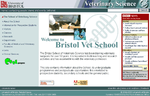
School of Veterinary Science
Website URL
 http://www.vetschool.bris.ac.uk http://www.vetschool.bris.ac.uk
Info
I'm employed by the University of Bristol as a courseware designer
and Webmaster for the Veterinary school. This is the site I work on
and maintain on a daily basis.
Design Notes
The Vet School wanted to ditch their old text based site and go for
one that was more aesthetic, accessible and easier to operate. Standard
HTML was used and help facilities were implemented throughout.
Back to top |
|
|
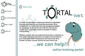
Tortal
Website URL
http://www.tortal.net
Info
Tortal are based in the USA and provide Internet based training for
the franchise industry. I initially went out to help set them up for
3 months in June 2000; I eventually got home in October 2001.
Design Notes
The purpose of this site was to get the concept of distance learning
and training across. The animation was designed to that end and proved
to be effective. In order to best emphasise the content it was important
that the site was simple, clean and low key. The idea behind the look
and feel of the site was to make the site feel less like the competitions
sites. We aimed to produce a site that was a "serious" business
site yet feel friendly and fun.
Flash based Training
There are examples of the flash based training I produced available
on the Tortal site.
Tortal Demonstration Courses URL
http://www.tortal.net/tortal/index3.htm
Back to top |
Flash animations
|
|
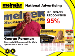
Meineke
Click to view
Info
This was issued on a mini CD as a part
of the pack give to prospective franchisees.
Design Notes
Meineke are the one of the biggest franchise operations operating
in the USA. This demo had to fit their corporate identity but that
needed a bit of a spruce up for a CD presentation. This is a fairly
tame page turning piece of work but it went down well and it's still
in use
Back to top |
|
|
|
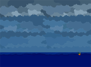
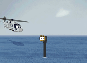
Westland System Assessment
Click
to view the Bond animation
Click
to view the air sea rescue animation
Click
to view the deterant animation
Info
I worked as part of the graphics team
on the Royal Navy's Merlin Helicopter computer based training.
Design Notes
Each of the instruction chapters had an introduction animation to
explain that module. These were either "serious" 3D anims
or cartoons. The cartoons were added as the Navy felt the courseware
was becoming to heavy and dull and that it needed breaking up.
I produced 90% of the cartoon animations most took the subject and
twisted it in some way. The first anim shown here was for the module
on wearing protective clothing. The idea of a guy getting dressed
seemed pretty dull so I jazzed it up a bit......
Back to top |
|
|
The new intro anim
Click to view
Info
This came about after a colleague bet me I couldn't do it.
Design Notes
This wasn't that difficult, the hardest part was getting hold of the
soundtrack. I'm probably also about to get a letter from the BBC's
solicitors!
Back to top |
|
|
The old intro anim
Click to view
Info
This was intro anim to my old website it's
been around for a while now but I still like it.
Design Notes
I wanted to do something really different. I'm was fed up of slick 3d
and Photoshop based images and effects. I wanted my site to have a more
organic artistic feel. It also needed to reflect who I am......
Back to top |